CSS Grid

The new Grid feature of CSS, which was recommended to the W3C on 9th February 2017, is intended to be a simpler way than existing methods using divs (or other block level elements) and floats in original layouts or with frameworks such as Bootstrap.

home1

Flexbox is another standard that has been release at about the same time but it has subtly different purposes. Flexbox is used to create containers in either columns or rows, whereas CSS Grid is designed to create layouts with either.

This means that Flexbox can potentially be used to create the basic layout of a page then CSS Grid to set out the content.

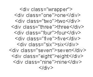
CSS Grid works by having block elements within a wrapper defined as a grid item, and when it is defined as a Grid item behaviour that has already been used in older browsers is overwritten (see Rachel Andrew’s article) which means you can leave it in place and overwrite it for browsers with CSS Grid enabled using a CSS feature query.

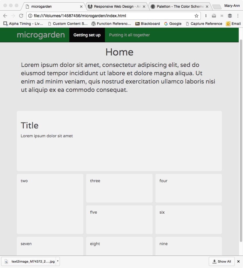
Layouts are almost as easy as the old table-based versions, while the later div-and-float based techniques were designed for less complex document layout where pages could be assumed to be viewed on a consistent range of devices. The Grid technique provides mechanism to lay content out in a way that adapts to the space available.

Browser support for Grid is uneven, but at the time of writing the following browsers support it.

FireShot Capture 1 - CSS Grid - Google Docs_ - https___docs.google.com_document_d_

CSS Grid

Visual hierarchy

home1

In the screenshot above, the biggest box will be the recommended next step, the second biggest will be another suitable step, and the others will be other steps that a user can do but aren’t quite as suitable.

There are three levels of content:

  1. Getting set up
  2. Inputs, outputs and components
  3. Putting it all together

Once a user has completed one level, the tasks on the next level will open up to them.

Visual hierarchy

Assessment of success

I think it will be impractical to set up a user testing session at my local home ed group as the students are most often in the mood to socialise and do group work and they do solo work at home where it’s quiet.

So I think the most effective way to judge success will be to measure the first few stages in the “Pirate Metrics” framework, with the ultimate measure of success being whether they refer someone else to the learning platform.

aarrr-pirate-metricsThe target group and their parents are continually asking for and giving recommendations for various services, and this measure has been used by the NHS since 2013 gathering over 25 million pieces of feedback.

I will also be using survey tools to obtain more qualitative feedback.


Assessment of success

CSS Grid

I’m learning how to use the new CSS Grid layout tool.

CSS
* {box-sizing: border-box;}
.wrapper {
max-width: 940px;
margin: 0 auto;
}

.wrapper > div {
border: 2px solid rgb(233,171,88);
border-radius: 5px;
background-color: rgba(233,171,88,.5);
padding: 1em;
color: #d9480f;
}.wrapper {
display: grid;
grid-template-columns: repeat(3, 1fr);
grid-gap: 10px;
grid-auto-rows: minmax(100px, auto);
}
.one {
grid-column: 1 / 4;
grid-row: 1 / 3;
}
.two {
grid-row: 3 / 5;
grid-column: 1;
}
.three {
grid-column: 2;
grid-row: 3;
}
.four {
grid-column: 3;
grid-row: 3;
}
.five {
grid-column: 2;
grid-row: 4;
}
.six {
grid-column: 3;
grid-row: 4;
}
.seven {
grid-column: 1;
grid-row: 5;
}
.eight {
grid-column: 2;
grid-row: 5;
}
.nine {
grid-column: 3;
grid-row: 5;
}

HTML
The HTML is displayed as an image as I couldn’t get the code to display.
text2image_M74372_20170405_095642

Here’s the results in a basic HTML page:

home1

CSS Grid