I’m learning how to use the new CSS Grid layout tool.
CSS
* {box-sizing: border-box;}

.wrapper {

  max-width: 940px;

  margin: 0 auto;

}
.wrapper > div {
border: 2px solid rgb(233,171,88);
border-radius: 5px;
background-color: rgba(233,171,88,.5);
padding: 1em;
color: #d9480f;
}.wrapper {
display: grid;
grid-template-columns: repeat(3, 1fr);
grid-gap: 10px;
grid-auto-rows: minmax(100px, auto);
}
.one {
grid-column: 1 / 4;
grid-row: 1 / 3;
}
.two {
grid-row: 3 / 5;
grid-column: 1;
}
.three {
grid-column: 2;
grid-row: 3;
}
.four {
grid-column: 3;
grid-row: 3;
}
.five {
grid-column: 2;
grid-row: 4;
}
.six {
grid-column: 3;
grid-row: 4;
}
.seven {
grid-column: 1;
grid-row: 5;
}
.eight {
grid-column: 2;
grid-row: 5;
}
.nine {
grid-column: 3;
grid-row: 5;
}
HTML
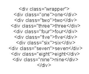
The HTML is displayed as an image as I couldn’t get the code to display.
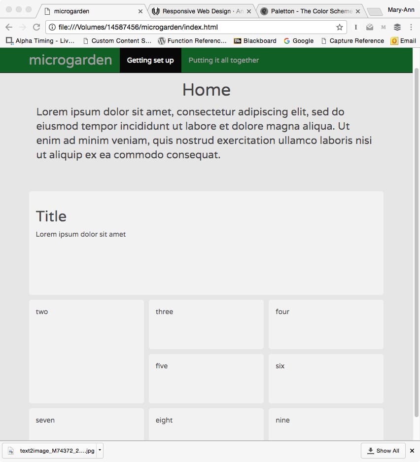
Here’s the results in a basic HTML page: